Check out our hand-y work. The new DOVU branding has landed.
Well this is exciting.
DOVU has a bold, new brand. One that perfectly complements our even bolder mission to help people offset carbon emissions by buying direct from carbon farmers across the globe.
Yep, you’ll have already spotted the branding in this blog’s image. But what’s the new look and feel all about?
Let’s delve a little deeper to see how it was created and how it helps us get our message out there.
In your hands
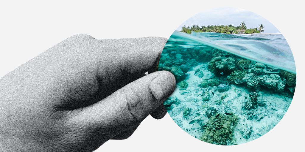
As you can see, our visual branding centres around hands. These represent our mission to give people more choices and control in shaping what happens next. Whether that’s backing local projects, or supporting carbon farmers in far-flung locations, the fact is: the future of the planet really is in our hands.
Palms and fingers will be featured on pretty much every visual we put out. You’ll see them directing you down the page, pointing you in the right direction, carrying key messages, even holding a whole ecosystem. Turns out, they’re really rather handy (sorry!).
The two-pronged palette

Okay, let’s talk colour. Our new brand palette isn’t your average bunch of brand colours. It has two distinct sides: subdued and bright.
The white, grey and Brand Blue form the foundation of each visual. They represent the business side of the brand. The ongoing hard work, the smart tech and seamless UI that makes us who we are.
Then there’s the bold green, yellow and fuchsia. Think of these as the actions we’re taking, the projects we’re supporting, the new initiatives we’re nurturing – and of course, the wonderful difference we’re making worldwide.
Our circular life

It makes perfect sense that a lot of our visual branding revolves around a circle. In nature, we see circles in every sunset, in the ripples of a lake and the full moon. The fact we’re advocating for a circular life is also relevant. And of course, there’s that all-important DOV token that makes our world go round.
We’re using the circles in quite a few ways, but in each of these perfect shapes is a vision of progress. You’ll see everything from rainbows to far-reaching forests and new seedlings to fertile soils.
As you might expect, the circles are always held in a hand. They can be held up, out – or any which way – as long as there’s a connection between human actions and our future vision.
The great news is, this look is pretty simple to recreate, so we’ll be using the device across social media posts, in our email signatures – and anywhere else that makes sense.
Meet the montage

Last, but definitely not least, meet the eclectic montages. When we’re looking to make a real splash, these are our go-to visual motifs. They’re a thing of beauty – even if we do say so ourselves!
These visual pieces not only make you stop and look, they’re also a smart way to visually share stories of our projects and the carbon farmers at heart of our mission.
You’ll see they use a combo of black and white photography (the foundations), alongside bold pops of colour. As with the palette, these bright details are the action elements. The projects we’re growing and the future we’re bringing into being.
If you look super closely, you’ll notice that some of the colourful elements have a more obscure feel about them. These are the flowers, petals and birds generated by machine learning. Just another reminder that when bright human beings work with smart technologies, beautiful things are born!
So there you have it
That’s the story of our new branding and how it came to be.
We’re chuffed to bits with it all. And we can’t wait to start using it to share our messaging, mission and vision with you – and the world.